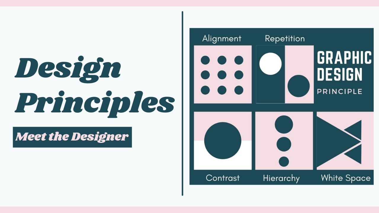
Principle of Graphic Design
- Categories Blogs
- Date April 13, 2021
PRINCIPLE OF GRAPHIC DESIGN
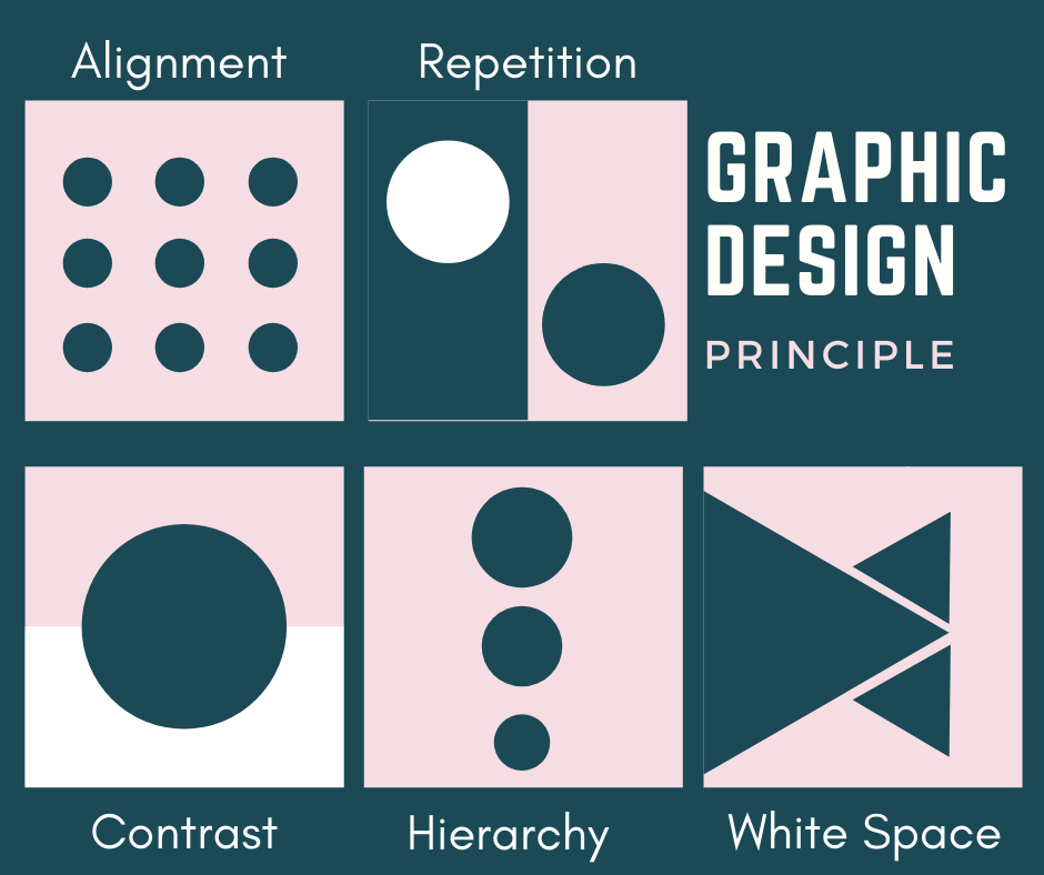
Can u you figure out difference between good design and bad design? Do you know What makes a “bad” design? What makes a “good” design? The fundamental principles of design are Alignment, wise Graphic designer always follow these principles to make a perfect and eye catching designs. Here in this graphic design blog I have explained important designing principles.
ALIGNMENT

Alignment is one of the most basic, but most important principles of any design, this principle allows our eyes to see design elements in order, have you ever faced designs which makes u confused where to look ? Right , Left or Cantered? This kind of messy designs are happen because there is no alignment principle applied in the particular design. Aligning elements with one another so that every item has a visual connection with something else on the page, tightens a design and eliminates the haphazard, messy effect which comes from random placement of elements.
CONTRAST

The difference between two or more objects in a design is referred to as contrast. The difference could be light and dark, thin and thick, small and large, bright and dull, etc. A bright blue button on a stark white background with a lot of white space is considered high contrast. If the button was almost the same color as the background or was a 1px stroke versus a fill, it would have less contrast. Most Common and eye catching Contrast we use is a text-based design, by using black text on a white background. he more the difference between the elements, the greater they are easy to compare and comprehend and that’s when they are said to have contrasted with each other. Contrast can be in shape , Color , Scale or layout. It is one of the important principle of graphic design.
REPETITION

Repetition is simply repeating a single element many times in a design. For example, you could draw a line horizontally and then draw several others next to it. Repetition can be useful in web and app design. For example, you’d expect the logo of a business to be repeated on every page and in the same place. repetition works with pattern to make the work of art seem active. The repetition of elements of design creates unity within the work of art. Repetition can be in shape , color .
HIERARCHY
Hierarchy is a visual design principle which designers use to show the importance of each page/screen’s contents by manipulating these characteristics: Size – Users notice larger elements more easily. Color – Bright colors typically attract more attention than muted ones. Hierarchy is one of the best way to view your design in rank. Hierarchy is not based on a design styles, but it is one of the important principle for any kind of designs,. A good designer leads his / her designs client’s eye through each area in priority order. One of the best example of hierarchy is articles in news papers. The headline is the most important thing on the page so you can identify what you’re reading; the intro gives you a summary of the article; and the content gives you the meat of the design principles. If we read the article from bottom to top, it wouldn’t make much sense.
SPACE

Space can be described as the distance around and/or the area between design objects or elements. As an example, if you were to place an image on a page, the area that does not contain the image would constitute space. Furthermore, this can be called white space or negative space. The use of space is particularly important when your design contains many of the other elements of design. Larger page margins will give a page a more ‘upmarket’ look and make it easier to follow. Carefully consider the placement of imagery that contains people so they have space to gaze or look into. To tie objects or elements together, only use small amounts of space between or around them. Don’t be afraid of space. There’s no need to fill up every area on a page. Remember, space gives the eyes a place to rest!


Read more blogs
You may also like
Demystifying the CSS Box Model: A Comprehensive Guide

Unlocking the Power of the AIDA Model: A Guide to Effective Copywriting


