In the realm of web development, mastering the CSS box model (web development course in Surat) is akin to understanding the fundamental building blocks that govern the layout and presentation of web pages. The box model serves as the foundation upon which designers and developers construct visually appealing and structurally sound interfaces. In this comprehensive guide, we embark on a journey to demystify the CSS box model, unraveling its intricacies, components, and implications for modern web design.

Understanding the CSS Box Model:
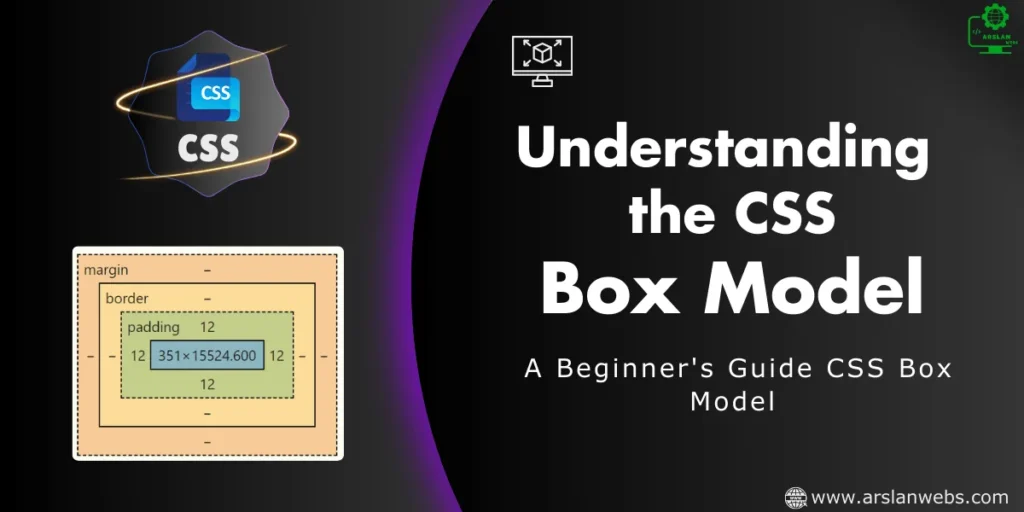
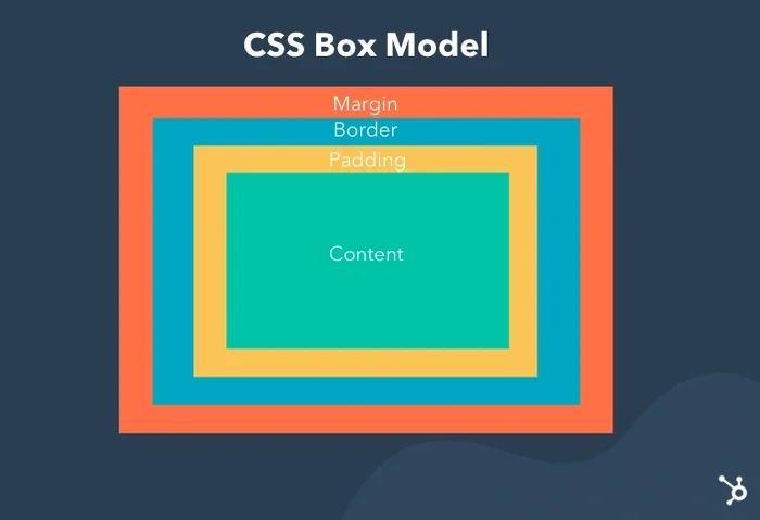
At its core, the CSS box model conceptualizes every HTML element as a rectangular box, comprising content, padding, borders, and margins. Each of these components contributes to the overall dimensions, spacing, and appearance of the element within the document flow.
1. Content Area:
The content area represents the innermost region of the box, where the actual content of the element resides. This content can include text, images, videos, or any other form of multimedia or interactive elements defined within the HTML markup.
2. Padding:
Padding refers to the space between the content area and the element’s border. It provides internal spacing, allowing designers to create visually appealing layouts and improve readability by adding breathing room around the content.
3. Border:
The border defines the outer boundary of the box and separates the content area from the surrounding elements. Borders can be styled, colored, and sized using CSS properties such as border-width, border-style, and border-color, allowing for a diverse range of visual effects and design choices.
4. Margins:
Margins represent the space between the element’s border and adjacent elements in the document flow. They provide external spacing, controlling the distance between elements and influencing the overall layout and composition of the web page.

Box Model Properties in CSS:
In CSS, several properties allow developers to control and manipulate the dimensions, spacing, and appearance of elements within the box model:
1. Width and Height:
The width and height properties determine the dimensions of the content area, allowing developers to specify the width and height of elements in absolute or relative units such as pixels, percentages, or ems.
2. Padding:
The padding property sets the internal spacing around the content area, defining the distance between the content and the border. Padding values can be specified individually for each side of the element (top, right, bottom, left) or using shorthand notation.
3. Border:
The border property defines the style, width, and color of the element’s border. Developers can customize border properties using shorthand notation or individual properties such as border-width, border-style, and border-color.
4. Margins:
The margin property controls the external spacing around the element, influencing its position within the document flow. Margins can be set individually for each side of the element or using shorthand notation to specify uniform margins on all sides.
Box Sizing:
By default, the width and height properties in CSS apply to the content area of an element, excluding padding, borders, and margins. However, the box-sizing property allows developers to alter this behavior and include padding and border widths in the specified width and height values.
By setting box-sizing: border-box, the specified width and height values include padding and border widths, ensuring a more intuitive and predictable layout behavior, particularly in responsive design scenarios.

Practical Applications and Best Practices:
Understanding the CSS box model is essential for creating well-structured, visually appealing layouts and user interfaces. Here are some practical applications and best practices to consider:
- Responsive Design: Leveraging the box model allows developers to create flexible and responsive layouts that adapt to different screen sizes and devices, ensuring optimal user experiences across various platforms.
- Whitespace and Readability: Properly utilizing padding and margins enhances readability and visual hierarchy by introducing whitespace and separation between elements, improving user comprehension and engagement.
- Consistency and Modularity: Consistently applying box model principles throughout a web project promotes modularity and maintainability, allowing developers to create reusable components and style patterns that can be applied across multiple pages and sections.
- Debugging and Troubleshooting: Understanding the box model aids in debugging layout issues and troubleshooting rendering discrepancies, empowering developers to identify and resolve styling conflicts and inconsistencies more efficiently.
In conclusion, the CSS box model serves as the cornerstone of modern web design, providing a systematic framework for organizing and styling content within web pages. By mastering the intricacies of the box model and applying best practices in layout and design, developers can create compelling, visually engaging interfaces that captivate audiences and deliver exceptional user experiences.


