In the expansive landscape of data visualization, Microsoft Power BI stands as a beacon for professionals seeking to translate raw data into actionable insights. In this blog post, we’ll explore the functionalities, uses, and advantages of four impactful visuals in Power BI: the Map, Filled Map, Gauge, and Card visuals at data analysis institute in surat. Whether you’re delving into Power BI for the first time or looking to enhance your data visualization skills, understanding the applications of these visuals is crucial for unlocking the full potential of your data.
1. Map Visual:
Uses:
The Map Visual in Power BI is a powerful tool for representing geographical data. It allows users to plot locations on a map and visualize spatial trends. Whether you’re analyzing sales performance across regions, tracking customer distribution, or monitoring the spread of a phenomenon, the Map Visual provides a spatial context to your data.
Example Data Set:
Consider a scenario where a retail business wants to analyze sales performance across different stores located in various cities. The Map Visual can be used to plot each store on the map, with color-coding indicating sales figures. This provides an instant visual representation of high and low-performing areas.

Creating a Map Visual in Power BI:
- Drag and drop the Map visual onto the report canvas.
- Assign the location field to the ‘Location’ category well.
- Assign the numerical field (e.g., sales figures) to the ‘Color saturation’ category well for color-coded representations.
2. Filled Map Visual:
Uses:
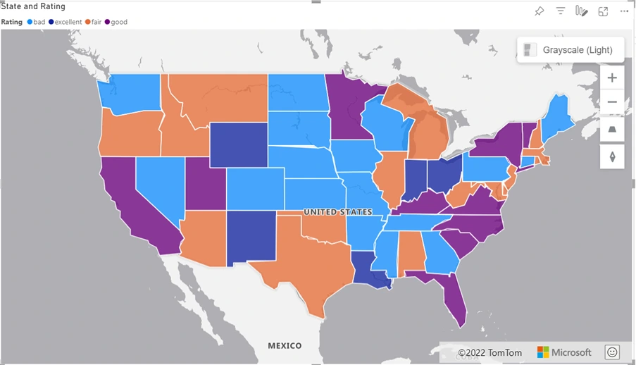
The Filled Map Visual in Power BI takes geographical visualization to the next level by allowing users to shade areas on a map based on numerical values. This is particularly useful for comparing data across regions and identifying patterns or disparities.
Example Data Set:
Imagine analyzing population density across different states in a country. The Filled Map Visual can depict this information by shading each state based on its population density. This provides a quick and intuitive understanding of how population is distributed geographically.
Creating a Filled Map Visual in Power BI:
- Drag and drop the Filled Map visual onto the report canvas.
- Assign the location field to the ‘Location’ category well.
- Assign the numerical field (e.g., population density) to the ‘Color saturation’ category well for shaded representations.
3. Gauge Visual:
Uses:
The Gauge Visual in Power BI is a dynamic tool for showcasing single values within a specified range. It is ideal for representing key performance indicators (KPIs) and gauging progress toward specific goals. Gauges offer a visually impactful way to convey whether a metric is within or outside the desired range.
Example Data Set:
Consider monitoring the completion rate of a project. The Gauge Visual can display the percentage of completion, with color-coding indicating whether the project is on track (green), at risk (yellow), or behind schedule (red).
Creating a Gauge Visual in Power BI:
- Drag and drop the Gauge visual onto the report canvas.
- Assign the numerical field (e.g., completion percentage) to the ‘Value’ category well.
- Customize the target values, colors, and formatting options to align with your specific KPI.

4. Card Visual:
Uses:
The Card Visual in Power BI is a simple yet effective tool for displaying a single value or a summary statistic. Cards are versatile and can be used to showcase metrics, totals, or key numbers that are essential for decision-making.
Example Data Set:
Imagine tracking the total revenue generated by a company. The Card Visual can be used to prominently display the current revenue figure, providing an easily digestible snapshot of the financial health of the organization.
Creating a Card Visual in Power BI:
- Drag and drop the Card visual onto the report canvas.
- Assign the numerical field (e.g., revenue) to the ‘Data field’ category well.
- Customize the appearance, format, and additional details to suit your reporting needs.
Advantages of These Visuals:
- Enhanced Spatial Understanding:
Map and Filled Map visuals provide a geographical context to data, aiding in the identification of regional patterns, trends, and disparities. - Dynamic KPI Monitoring:
Gauge visuals offer a dynamic and visually appealing way to monitor key performance indicators, allowing users to quickly assess whether metrics are on target. - Efficient Single-Value Representation:
Card visuals provide a concise and efficient means of representing single values or summary statistics, making them ideal for executive dashboards and reports. - User-Friendly Interaction:
Power BI allows users to interact with these visuals dynamically, enabling drill-downs, filters, and detailed exploration of data points.

Conclusion:
In the ever-evolving landscape of data visualization, mastering the Map, Filled Map, Gauge, and Card visuals in Power BI is paramount for effective storytelling and decision-making in data analysis institute in surat. Whether you’re a data analyst, business professional, or a beginner exploring Power BI, incorporating these visuals into your toolkit will elevate your ability to communicate insights and glean meaningful information from your data.
As you embark on your data visualization journey, remember that each visual serves a unique purpose, from providing a spatial context to dynamically monitoring KPIs. By harnessing the power of these visuals, you’re not just creating charts; you’re telling a compelling story with your data, making it accessible and impactful for a diverse audience (data analysis institute in surat).

