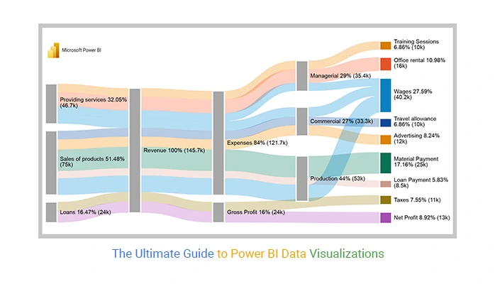
In the ever-evolving landscape of data analysis, visualizations play a pivotal role in transforming raw data into actionable insights. Microsoft Power BI, with its versatile array of visualization tools, empowers users to explore Data Analysis course in dynamic and meaningful ways. In this blog post, we’ll delve into three powerful visualizations in Power BI: the Funnel, Donut Chart, and Treemap. We’ll explore their uses, and advantages, and provide examples of datasets where these visualizations shine.

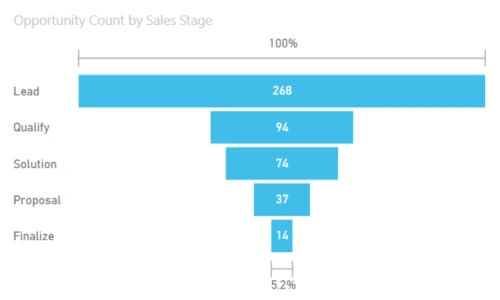
1. Funnel Visualizations:
Uses:
Funnel visualizations in Power BI are a compelling way to represent stages in a process and visualize the conversion rates at each stage. These are particularly useful in scenarios where data follows a sequential flow, such as sales pipelines, marketing funnels, or user onboarding processes.
Example Data Set:
Consider a sales scenario where leads progress through stages like “Lead,” “Contact Made,” “Proposal Sent,” “Negotiation,” and “Deal Closed.” The funnel visualization can vividly illustrate the drop-off rates at each stage, providing insights into the efficiency of the sales process.
Creating a Funnel in Power BI:
- Drag and drop the Funnel chart visual onto the report canvas.
- Assign the relevant fields to the stages of the funnel (e.g., Lead, Contact Made, etc.).
- Customize the colors, labels, and formatting options to enhance visual clarity.
2. Donut Chart:
Uses:
A Donut Chart in Power BI is a circular variation of the classic pie chart and Data Analysis course . It is effective for displaying the proportion of individual components within a whole while allowing for better utilization of space. Donut charts are ideal for showcasing categorical data and emphasizing the contribution of each category.
Example Data Set:
Imagine analyzing the distribution of the marketing budget across various channels like “Social Media,” “Email Marketing,” “SEO,” and “Paid Advertising.” A Donut Chart can vividly illustrate the proportion of the budget allocated to each channel.
Creating a Donut Chart in Power BI:
- Drag and drop the Donut Chart visual onto the report canvas.
- Assign the relevant categorical field to the values section.
- Customize the appearance, labels, and data labels to enhance readability.
3. Treemap Visualizations:
Uses:
Treemaps in Power BI offer an innovative way to visualize hierarchical data structures. They are excellent for representing data that has nested categories and subcategories. Treemaps efficiently communicate the hierarchical relationships within the data, making them valuable for scenarios like organizational structures, file storage distribution, or budget allocation across departments.
Example Data Set:
Consider a scenario where you want to analyze the budget distribution across different departments and their respective teams. The treemap can visually represent the hierarchy, showing how the budget is distributed from the top-level departments down to individual teams.
Creating a Treemap in Power BI:
- Drag and drop the Treemap visual onto the report canvas.
- Assign the relevant fields to the groups and values sections, representing the hierarchical structure.
- Customize the colors, labels, and formatting options to enhance visual appeal.
Advantages of These Visualizations:
- Clarity and Simplicity:
Funnel, Donut, and Treemap visualizations offer a clear and straightforward representation of data. They simplify complex information, making it accessible to a wide audience, from stakeholders to data analysts. - Effective Communication:
These visuals enhance the communication of insights. Whether it’s showcasing conversion rates, proportional distributions, or hierarchical structures, these visualizations make it easy for viewers to grasp key information. - Space Optimization:
The compact nature of these visuals allows for efficient use of space on reports and dashboards. This is particularly important when dealing with limited-screen real estate or when presenting summaries in executive-level reports. - Interactivity:
Power BI enables users to add interactive elements to these visualizations. Viewers can drill down into specific data points, filter information, and dynamically interact with the visuals to gain deeper insights.
Conclusion:
In the realm of data analysis, the journey from raw data to meaningful insights is paved with powerful visualizations. Funnel, Donut Chart, and Treemap visuals in Power BI (Data Analysis course ) stand out as versatile tools that cater to specific analytical needs. As we’ve explored their uses and advantages, it becomes evident that these visuals go beyond mere aesthetics – they are indispensable for conveying complex information in a digestible format.
Whether you’re analyzing sales pipelines, budget allocations, or organizational structures, mastering these visualizations in Power BI enhances your ability to extract actionable insights. As you embark on your data analysis journey, consider incorporating these visuals into your toolkit, and watch as your data comes to life, telling a compelling story that drives informed decision-making.