Introduction
Data visualization is a critical aspect of data analysis, enabling analysts to interpret, communicate, and derive insights from complex datasets. Pandas, a powerful data manipulation library in Python, offers built-in plotting capabilities that facilitate quick and effective DataFrame visualization. This section explores the fundamentals of plotting with Pandas, customization techniques for clarity and impact, and integration with advanced visualization libraries like Matplotlib and Seaborn for comprehensive data analytics.
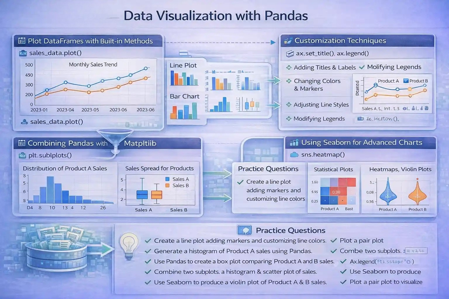
Plotting DataFrames with Built-in Plotting Methods
Overview
Pandas provides a straightforward DataFrame.plot() method, which leverages Matplotlib to create a wide variety of statistical and graphical plots directly from DataFrame objects. This feature simplifies the visualization process, allowing users to generate plots such as line charts, bar plots, histograms, box plots, and area charts without extensive code.
Types of Plots with Pandas
- Line Plot: Ideal for showing trends over time or ordered data.
- Bar Chart: Suitable for comparing categorical data.
- Histogram: Used to observe data distribution.
- Box Plot: Useful for identifying data spread and outliers.
- Area Chart: Demonstrates cumulative data over a period or categories.
Use Cases and Examples
import pandas as pd
import matplotlib.pyplot as plt

# Sample sales data
sales_data = pd.DataFrame({
    'Month': pd.date_range(start='2023-01-01', periods=6, freq='M'),
    'Product_A': [250, 300, 280, 320, 330, 360],
    'Product_B': [200, 220, 210, 250, 270, 300]
})

# Plotting sales over time
sales_data.set_index('Month')[['Product_A', 'Product_B']].plot()
plt.title('Monthly Sales Trend')
plt.xlabel('Month')
plt.ylabel('Sales Volume')
plt.show()Customizing Charts for Data Insights
Rationale for Customization
While Pandas’ default plots are functional, customizing charts enhances readability and emphasizes key data patterns. Effective visualization aids in storytelling, decision-making, and presenting professional reports.
Customization Techniques
- Adding Titles and Axis Labels: Clarifies plot context.
- Changing Colors and Markers: Differentiates categories or highlights specific data points.
- Adjusting Line Styles and Widths: Improves visual clarity.
- Modifying Legends: Ensures clear identification of plotted series.
- Using Subplots: Compares multiple aspects simultaneously.
Practical Example
ax = sales_data.set_index('Month')[['Product_A', 'Product_B']].plot(kind='line', color=['blue', 'orange'], marker='o', linewidth=2)
ax.set_title('Monthly Sales Comparison')
ax.set_xlabel('Month')
ax.set_ylabel('Sales Volume')
ax.legend(['Product A', 'Product B'])
plt.grid(True)
plt.show()Integrating Pandas with Matplotlib and Seaborn for Advanced Visualization
Combining Pandas and Matplotlib
While Pandas’ built-in plotting covers many needs, integrating with Matplotlib unlocks advanced features:
- Customized subplots for complex layouts.
- Annotations, text labels, and interactive elements.
- Fine control over figure aesthetics.
Example: Subplots with multiple visualizations
fig, axes = plt.subplots(2, 1, figsize=(8, 10))
# Histogram
sales_data['Product_A'].plot(kind='hist', ax=axes[0], color='skyblue', bins=5)
axes[0].set_title('Distribution of Product A Sales')
# Box Plot
sales_data[['Product_A', 'Product_B']].boxplot(ax=axes[1])
axes[1].set_title('Sales Spread for Products')
plt.tight_layout()
plt.show()
Using Seaborn for Statistical and Publication-Quality Charts
Seaborn, built on Matplotlib, simplifies creating attractive, highly informative visualizations:
- Heatmaps for correlation matrices.
- Violin plots for data distribution insights.
- Pair plots for exploring relationships between variables.
Example: Correlation heatmap
import seaborn as sns

corr = sales_data[['Product_A', 'Product_B']].corr()
sns.heatmap(corr, annot=True, cmap='coolwarm')
plt.title('Correlation between Product Sales')
plt.show()
Benefits for Data Science and Machine Learning
These advanced visualization techniques support exploratory data analysis (EDA), model interpretability, and presentation of results, forming an integral part of the data analysis workflow.
Practice Questions
- Create a line plot for the sales data, adding markers and customizing line colors.
- Generate a histogram of Product A sales using Pandas, and interpret the data distribution.
- Use Pandas to create a boxplot comparing Product A and Product B sales.
- Customize a Pandas plot with a title, axis labels, and legend for the sales data.
- Combine two subplots: a histogram of Product B sales and a scatter plot of sales vs. months.
- Create a heatmap showing correlations between all numerical columns in a DataFrame.
- Use Seaborn to produce a violin plot of sales for Product A and B.
- Plot a pair plot to visualize relationships between different products’ sales data.
- Integrate Pandas plotting with Matplotlib to add annotations marking peaks or outliers.
- Explain the advantages of customizing visualizations in data-driven decision-making.
Code Outputs
(These should follow each question when attempted with actual datasets, providing visual confirmation.)
Resources for Further Study
- Pandas Documentation – Plotting
- Matplotlib Official Guide
- Seaborn Documentation
- W3Schools Python Data Visualization
- GeeksforGeeks Pandas Visualization Tutorials
This structured material aims to deepen understanding of data visualization with Pandas, emphasizing both fundamental plotting and advanced customization to facilitate comprehensive data analysis, reporting, and storytelling.
More Courses
- Advanced Data Analytics with Gen AI
- Data Science & AI Course
- Advanced Certificate in Python Development & Generative AI
- Advance Python Programming with Gen AI