
Mobile-friendly websites and user experience play a huge role in modern SEO success. Whether you are learning through the best digital marketing certification, exploring marketing courses with certificates, upgrading skills through Website optimization classes, gaining knowledge from a performance marketing course, or studying in a digital marketing course with placement, understanding mobile optimization and user experience is extremely important to rank higher and convert visitors into customers.
⭐ Why Mobile-Friendly SEO Matters Today?
Today, most users browse, search, shop, and learn using mobile phones.
If your website is not mobile-friendly, Google simply does not prefer ranking it.
“If your website does not work properly on mobile, it does not work for SEO.”
Mobile optimization is not optional anymore — it is necessary.
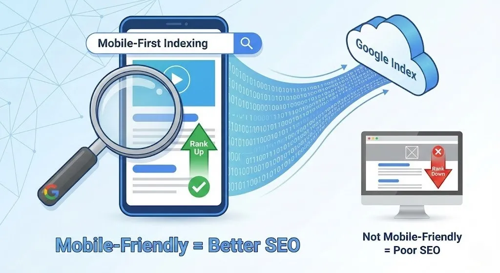
How Google Looks at Mobile Experience
Google uses Mobile-First Indexing.
This means Google mainly checks your mobile version of the website before ranking it.
Mobile-Friendly = Better SEO
Not Mobile-Friendly = Poor SEO
Every expert in Website optimization classes explains this clearly because mobile users dominate the internet.
Key Mobile-Friendly SEO Factors
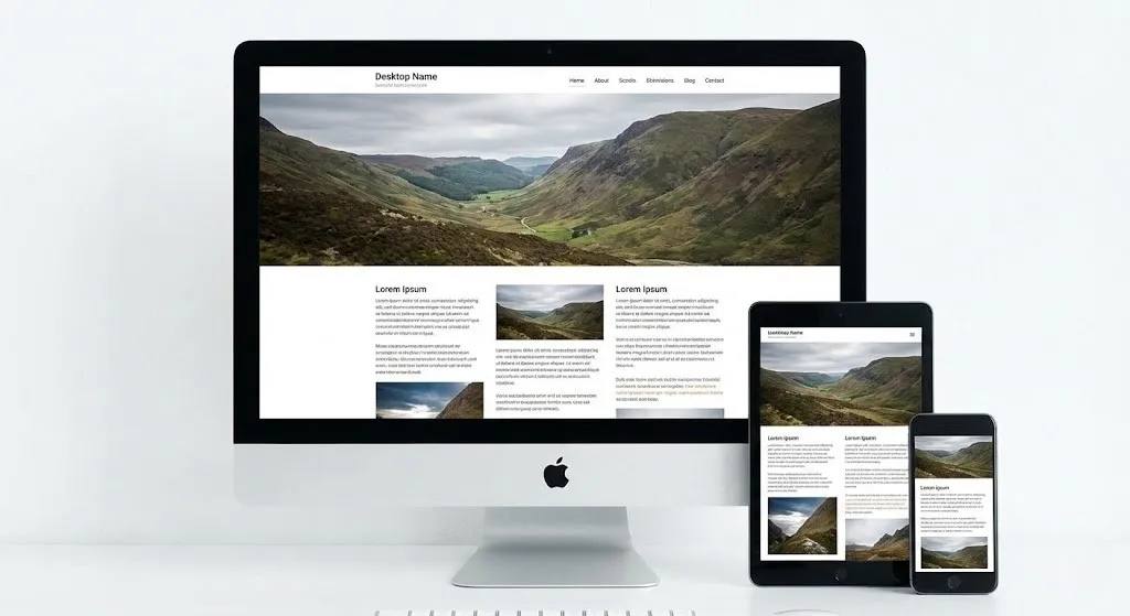
1️⃣ Responsive Web Design
Your website should automatically adjust according to:
- Mobile
- Tablet
- Desktop
No zooming
No scrolling left-right
Easy to read and easy to use
RESPONSIVE DESIGN TIP
A responsive website:
- Looks good on all screen sizes
- Keeps users happy
- Improves rankings
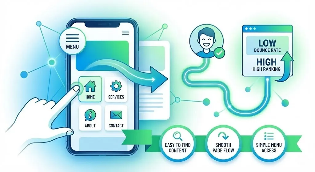
2️⃣ Mobile-Friendly Navigation
Users should:
- Easily find content
- Move smoothly between pages
- Access menu without difficulty
If people struggle to navigate → They leave → Bounce rate increases → Ranking drops
Good user navigation is highly emphasized in the best digital marketing certification programs.
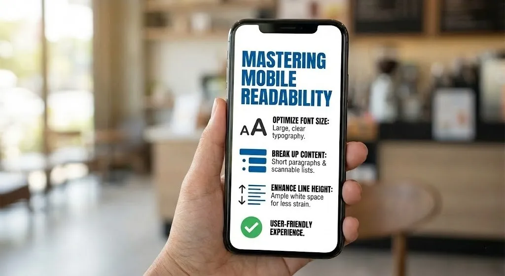
3️⃣ Font Size & Readability
Text should be:
- Clear
- Readable
- Not too small
Long paragraphs on mobile feel stressful. Use short, simple, easy-to-read content.
4️⃣ Page Speed & Performance
Mobile users don’t wait.
If your website takes more than 3 seconds to load, most users leave.
Slow Website = Lost Visitors
Fast Website = Happy Users + Better SEO
This is also taught in every performance marketing course because slow websites kill performance, leads, and revenue.
💡 Real Life Example 1
A training institute had a beautiful website—but only on desktop.
On mobile:
- It was slow
- Text was too small
- Pages were not responsive
Result?
Traffic dropped and enquiries were very low.
After guidance during their digital marketing course with placement, they:
- Made website responsive
- Improved speed
- Structured navigation
Soon:
Traffic increased
Users stayed longer
Admissions increased
Mobile optimization changed everything.
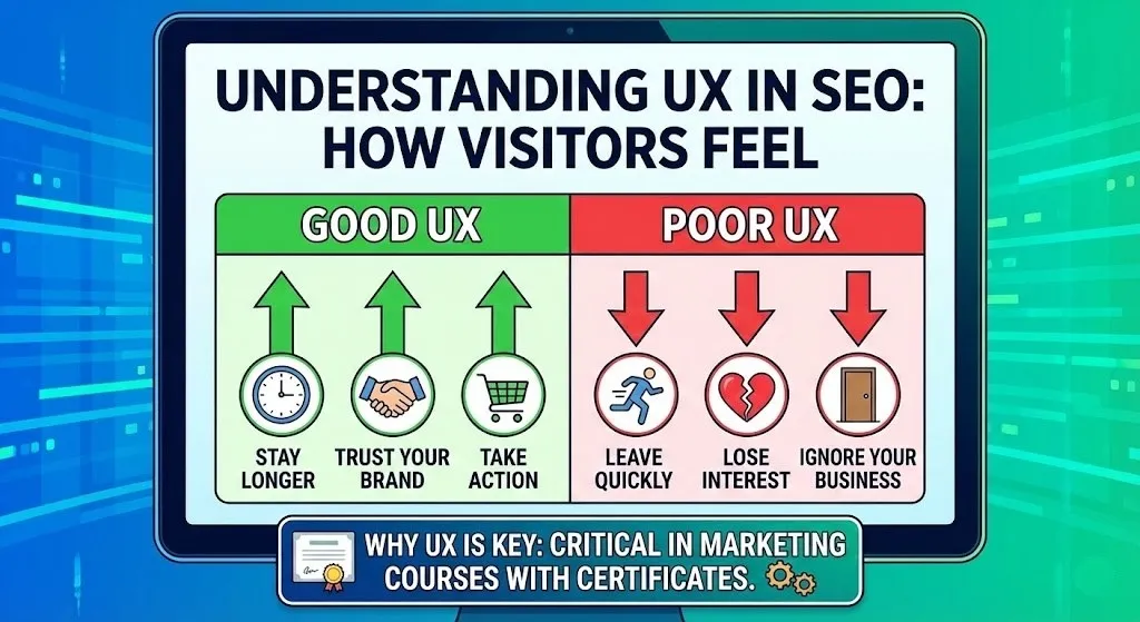
🧠 Understanding User Experience (UX) in SEO
User Experience means how your visitors feel while using your website.
Good UX Makes Users:
- Stay longer
- Trust your brand
- Take action
Poor UX Makes Users:
- Leave quickly
- Lose interest
- Ignore your business
That is why UX is always discussed in marketing courses with certificates.
📊 UX & SEO Relation Table
| UX Factor | Impact | SEO Effect |
| Easy Navigation | Better browsing | Higher ranking |
| Fast Speed | Better engagement | Lower bounce |
| Readability | Comfortable reading | Better time on site |
| Mobile Friendly | Better experience | Strong SEO |
| Clean Layout | Professional trust | Conversions |
5️⃣ Core Web Vitals (Very Important)
Google checks:
- LCP (Largest Contentful Paint) – How fast the main content loads
- CLS (Cumulative Layout Shift) – Does layout move while loading?
- INP – Interaction speed
Good vitals = Strong SEO support
Bad vitals = Poor ranking chances
These concepts are deeply taught in Website optimization classes.
💬 Real Life Example 2
A blogging website had great content.
But:
- Too many pop-ups
- Advertisements disturbed reading
- Page layout kept shifting
Users became frustrated and left.
Later, they learned UX improvement techniques from a performance marketing course, reduced distractions, and improved UX.
Result?
Pages ranked better
Readers stayed longer
Revenue increased
User happiness = SEO success.
Best Practices to Improve Mobile & UX SEO
✔ Use Simple & Clean Design
Avoid:
- Overloaded graphics
- Too many ads
- Unnecessary animations
Clean design builds trust.
✔ Keep Buttons & CTAs Mobile Friendly
Buttons should be:
- Big enough to tap
- Easy to click
- Clearly visible
People should not struggle to press buttons.
✔ Use Short & Clear Content
Mobile users prefer:
- Short paragraphs
- Bullet points
- Simple English
This type of clarity is emphasized in every best digital marketing certification program.
✔ Use Proper Spacing
White space helps:
- Eyes relax
- Reading feel easy
Overcrowded pages look stressful.
✔ Avoid Heavy Media on Mobile
Too many videos, images, animations = slow website
Balance visuals wisely.
💡 Real Life Example 3
An ecommerce website had amazing products but poor UX:
- Slow speed
- Complex mobile checkout
- Confusing layout
Sales were low.
After UX training from a Professional digital marketing environment, they:
- Simplified pages
- Improved mobile design
- Enhanced speed
Sales improved significantly.
Good UX is not just for ranking — it brings business success.
USER EXPERIENCE IMPROVEMENT
To improve UX
- Make browsing smooth
- Make navigation easy
- Make design simple
- Make content readable
Good user experience = Happy users + Better Google ranking.
❌ Common Mobile & UX SEO Mistakes
Avoid these:
➡️Non-responsive websites
➡️Small text
➡️Slow pages
➡️Too many pop-ups
➡️Confusing design
➡️Poor navigation
Bad UX always leads to poor SEO.
🧾 Best Practice Checklist
Use this checklist every time:
✔ Responsive design
✔ Fast loading pages
✔ Clear text and readability
✔ Easy navigation
✔ Strong Core Web Vitals
✔ Clean structure
✔ Mobile-first approach
Follow this and your website will automatically perform better.
🎯 Final Thoughts
Mobile-friendliness and user experience are not just design elements — they are strong ranking factors and powerful business boosters.
Whether you study through the best digital marketing certification, enroll in marketing courses with certificates, learn in Website optimization classes, train under a performance marketing course, or upgrade skills with a digital marketing course with placement, mastering mobile optimization and user experience will always give you the strongest advantage.
If your website is mobile-friendly, fast, readable, and user-focused…
Google will love it.
Users will trust it.
And your business will grow continuously.
Disclaimer: The images and videos used in this blog are for educational and illustrative purposes only. Some visuals may be generated using AI tools, while others are sourced from publicly available platforms. We do not claim ownership of any third-party images or videos. All rights and credits belong to their respective owners.